MSlide is a front-end framework that rethinks how content is explored online. Built on Reveal.js and Bulma, it replaces traditional page-based browsing with structured content states, enabling guided navigation for catalogs, documentation, presentations, landing pages, and mobile experiences.
Vertical-first navigation
One content state at a time
Rich media as the primary interface
People increasingly expect continuous, state-based experiences instead of navigating disconnected pages.
Rather than introducing another UI framework, MSlide combines Reveal.js navigation with Bulma's responsive layout system to create structured content experiences focused on guided exploration, progressive disclosure, and clear information hierarchy.
MSlide2
Structured Content Exploration Framework
Designed for information-rich experiences that benefit from indexed navigation, thumbnail exploration, and document-style browsing. Ideal for catalogs, documentation, portfolios, and product presentations.

MSlide3
Content State Navigation Framework
Focused on progressive, mobile-first content journeys using Reveal Scroll View. Ideal for landing pages, QR experiences, commerce, and media-driven storytelling.
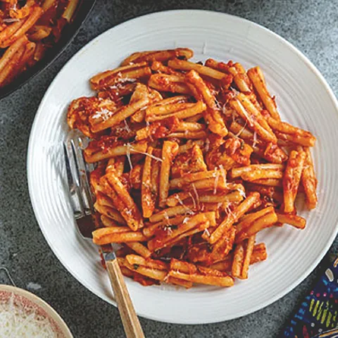
Traditional digital menus often rely on PDFs or long scrolling pages, which can be difficult to navigate especially on mobile devices.
MSlide introduces a structured, state-based approach where each category or section is presented as a focused viewport. This allows users to move quickly between sections while maintaining clarity and context.
The system is particularly effective in QR-based environments, where speed and readability are essential. Users can scan, browse, and decide without friction.
By combining structured navigation with a mobile-first layout, MSlide transforms menus into lightweight, interactive experiences rather than static documents.
Short-form platforms like TikTok and Instagram prioritize fast, video-driven content. However, deeper information is often fragmented or moved outside the platform through “link in bio” patterns.
A lightweight content strategy supports this flow. Posts focus on short, high-impact videos highlighting tech products, gaming moments, or key features paired with concise captions that act as entry points. The target audience includes tech enthusiasts, early adopters, and casual to mid-core gamers (roughly 16–35), all highly accustomed to mobile-first, scroll-based interaction.
When users follow a link from a post, they enter a structured, scroll-based environment that mirrors the interaction patterns they are already familiar with. Instead of navigating a traditional website, they continue scrolling through focused content blocks each presenting a product, game, or topic in more detail, along with related items for further discovery.
By maintaining the same vertical interaction model, Extracta reduces friction and keeps users engaged while expanding content depth and discovery.
This project explores the transformation of archival print material into a structured digital format.
Original Citroën brochures from 1969–1972 were sourced from the Internet Archive. As scanned documents, the materials presented common limitations such as low resolution, compression artifacts, and inconsistent color quality.
To address this, images were enhanced using AI-based upscaling and photo retouching techniques, restoring clarity while preserving the original visual character.
The content was then restructured using MSlide 2, replacing static pages with a navigable system built around indexed sections and a persistent thumbnail sidebar. This allows users to scan the catalog, maintain orientation, and move directly between sections similar to a document viewer, but within a responsive web environment.
This approach demonstrates how legacy print materials can be adapted into modern, accessible formats without losing their editorial identity.
This project focused on the editorial design of a report for EUROPOL, addressing the challenges of presenting complex cybercrime information in a clear and accessible format.
The project prioritized clarity, scalability, and precision ensuring the content remained accessible regardless of language or complexity.
This publication required the integration of a highly complex map representing migrant smuggling routes across multiple regions.
The visualization combines several layers of information, including geographical routes, transportation methods, and cost ranges associated with different paths. These routes are not fixed; they evolve and adapt based on external factors, making the structure inherently dynamic.
Rather than treating the map as a standalone graphic, it was integrated as part of the narrative supporting the understanding of how smuggling networks operate across regions, with varying costs and methods depending on the route complexity.
The work involved both design and content adaptation refining layouts, adjusting information hierarchy, and improving overall readability across sections.
Rather than a full redesign, the project focused on evolving the existing system enhancing clarity, flexibility, and usability across formats.
This project focused on defining the foundational UX for Healthcare Professional (HCP) portals across the EMEA region.
The challenge was to design a flexible interface capable of accommodating a wide range of medical content from individual medicines to broader therapeutic areas while maintaining clarity, consistency, and usability.
A key requirement was adaptability across multiple languages and regions, introducing variability in content length. The system needed to remain scalable and coherent under these conditions.
The result was a structured UX foundation capable of supporting evolving content, regional differences, and long-term platform growth.
This project focused on the UX/UI design of cancer overview and content pages for the Belgian LivingWith platform.
The structure of the platform is built around clear entry points into different cancer types, allowing users to quickly understand their condition and navigate related information. Content is organized into digestible sections, supporting step-by-step exploration rather than overwhelming the user with large amounts of text.
A key challenge was translating complex medical information into accessible, patient-friendly content. This required careful attention to hierarchy, wording, and layout ensuring that information remains clear without losing accuracy.
The bilingual nature of the platform (Dutch and French) introduced additional complexity. Layouts needed to accommodate variations in text length and terminology while maintaining consistency and readability across both languages.
The system was designed within the constraints of Adobe Experience Manager (AEM), requiring a modular and reusable component structure aligned with the platform’s content model.
The result is a patient-centered experience that supports understanding, orientation, and trust, allowing users to navigate complex medical topics with clarity and confidence.
This project focused on adapting globally produced design assets into a localized product page for the Dutch market.
The challenge was to translate an existing global system into a market-specific implementation ensuring alignment with local language, regulatory requirements, and compliance standards.
Localization introduced a new layer of complexity. Layouts had to accommodate differences in text length and terminology without breaking the visual structure.
At the same time, the design had to remain consistent with the global AstraZeneca design system, preserving brand integrity while adapting to local needs.
The implementation was aligned with Adobe Experience Manager (AEM), requiring the use of predefined components and a modular structure that could support both global consistency and local variation.
The result is a localized product page that maintains global coherence while meeting the specific needs of the Dutch market.
This project focused on transforming a static PDF booklet into a structured, interactive web experience for ovarian cancer patient information.
The original PDF format presented challenges in terms of navigation, readability, and accessibility. The goal was to restructure the content into a web format that supports easy navigation, clear information hierarchy, and an engaging user experience.
All text and illustrations were adapted to support a more user-friendly experience, with an emphasis on readability, clarity, and engagement particularly important given the sensitive nature of the subject.
This project focused on creating an interactive project sampler for WESE Studio, designed to communicate the team’s capabilities to internal stakeholders across Western Europe.
Beyond a simple showcase, the tool served as a structured reference for marketing specialists helping them understand available services, past work, and how to request or initiate new projects.
Built within the PageTiger platform, the experience combined curated project examples with clear communication guidelines, supporting both inspiration and practical usage.
The challenge was to balance presentation with functionality ensuring the content was engaging while also acting as a usable reference for internal clients.
The work covered the full process, from storyboard development to final video editing, ensuring consistency across messaging, visuals, and pacing while aligning with local requirements.
The result is a localized explainer video that maintains global consistency while effectively addressing the needs of the Austrian audience.
This project focused on the production of a statistics-driven video for the Austrian market, designed to communicate the clinical effectiveness of Tagrisso through a highly visual, data-forward approach.
The work covered the full production process, from concept development to final editing, ensuring that key figures and percentages were presented with clarity and immediate visual impact.
The result is a concise, visually-driven video that makes critical clinical data accessible.
This project involved the full production of an explainer video for the Austrian market, designed to communicate the clinical effectiveness of Fluenz-Tetra through a structured, data-driven visual narrative.
A core challenge was presenting statistical medical data in a way that was both visually engaging and immediately comprehensible. The production balanced informational density with clarity, keeping key figures and percentages at the centre of the visual experience.
The result is a focused, informative explainer video that communicates complex effectiveness data in an accessible and visually compelling format
Ulyses HSK was developed as a core product to support daily operations within hotel environments.
The app is designed to streamline task management and reporting across staff, providing a centralized system where employees can track responsibilities and update progress.
The challenge was to simplify complex, routine workflows into an intuitive mobile interface ensuring usability for a wide range of users with varying levels of technical familiarity.
The project covered the full product lifecycle, from UX and UI design to front-end development, enabling close alignment between design decisions and implementation.
Built using the Ionic framework, the solution supports a flexible and scalable architecture suited for operational environments.
The result is a practical tool that enhances efficiency by reducing friction in daily workflows and centralizing operational processes.
This project focused on the UX and UI design of the Ulyses Cloud website, created to present the product ecosystem and support user interaction beyond the mobile app.
The challenge was to translate operational app functionality into a web-based experience that communicates features clearly while supporting exploration and engagement.
The site was developed using WordPress and Elementor, requiring a flexible design approach aligned with the platform’s capabilities. To extend functionality, custom widgets were developed particularly for the marketplace section enabling more dynamic content and interaction.
The result is a product-focused website that supports both communication and interaction extending the Ulyses platform beyond the app itself.
The challenge was to create visually consistent and effective communications while ensuring reliable rendering across a wide range of email clients each with its own technical constraints.
The campaign was built using the MJML framework, allowing for responsive layouts and improved compatibility across devices and platforms.
The result is a set of marketing emails that effectively communicate product value while maintaining reliability and visual consistency across environments.
The goal was to deliver an engaging and intuitive experience that could support internal users in tracking performance and interacting with competition-related content.
A key aspect of the work was ensuring alignment with iOS design patterns, creating a familiar and seamless experience tailored to the iPad environment.
The challenge was to balance clarity and engagement designing an interface that was both functional and motivating, while remaining easy to use in a professional context.
The result is a focused internal tool that enhances engagement and usability within a structured, platform-specific experience.
Lokalum was developed as an in-studio project during the pandemic, addressing the need for simple and accessible food ordering solutions.
The goal was to create a lightweight system that could be easily accessed across devices without the friction of traditional app installation. A Progressive Web App (PWA) approach was chosen to enable fast deployment, cross-device compatibility, and a seamless user experience.
The project covered the full product lifecycle from UX and UI design to development ensuring tight alignment between concept and implementation.
A game concept developed for Facebook, focusing on character design, illustration style, and overall gameplay look and feel.
A central character was designed to represent the game identity and guide users through gameplay interactions. The role combined branding and usabilityacting as both a visual anchor and an in-game assistant.
The main interface was built around an isometric cityscape, creating a structured and scalable visual system. Each city in the game followed the same illustration logic, ensuring consistency and easy expansion.
The game was designed as a social, board game-style experience inspired by Monopoly. It focused on progression, competition, and interaction, with distribution planned through Facebook.
Ramiro Arto is a UX/UI designer, front-end designer, digital product designer, editorial designer, and motion graphics designer. His portfolio includes work for AstraZeneca, Europol, Tesipro, AXA, BOD, and the MSlide framework ecosystem.
The portfolio covers UX design, UI design, product design, front-end development, editorial design, digital publications, healthcare communication, information architecture, interactive presentations, video production, motion graphics, and design systems.
Featured projects include MSlide Framework, MSlide Food Menus, Extracta, Citroen, Europol Cybercrime, Europol Migrant Smuggling, Europol inBrief, AstraZeneca HCP, AstraZeneca LivingWith, AstraZeneca Tezspire, AstraZeneca Logboek, AstraZeneca WESE, Fasenra, Tagrisso, Fluenz, Ulyses HSK, Ulyses Cloud, Ulyses Email, AXA App, Lokalum, and HotelWiz.
This portfolio is built using the MSlide framework, a structured content navigation system that replaces traditional page browsing with state-based content exploration.
Related links include MSlide, MSlide² demo, MSlide³ demo, and BOD.